Product design · 2020
Voyager
A health super-app, codenamed Voyager. One place for the five things you keep meaning to fix about yourself.
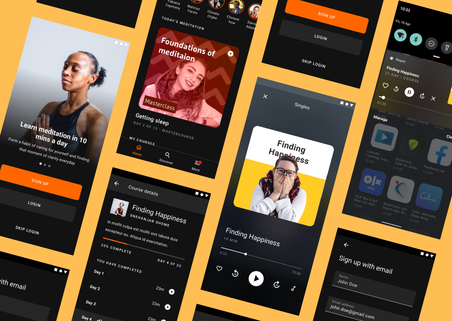
Roundglass Reach started life as Voyager, a single health app spanning meditation, mental wellbeing, nutrition, fitness, and condition management. We shipped meditation first, in private beta, and laid the groundwork for the rest.
Why a super-app
People manage their health across half-a-dozen disconnected apps. Each one solves a slice; together they create fragmented health information and a low-grade anxiety about which app to open at 11pm on a Tuesday. The product brief was uncompromising: a one-stop solution for all of your health needs, beginning with mindfulness and expanding to four more verticals within a year. Mental wellbeing, nutrition, fitness, and condition management with doctor consultations.
The first public release would replace the existing Roundglass Reach app in the App Store and Play Store.
Who we built it for
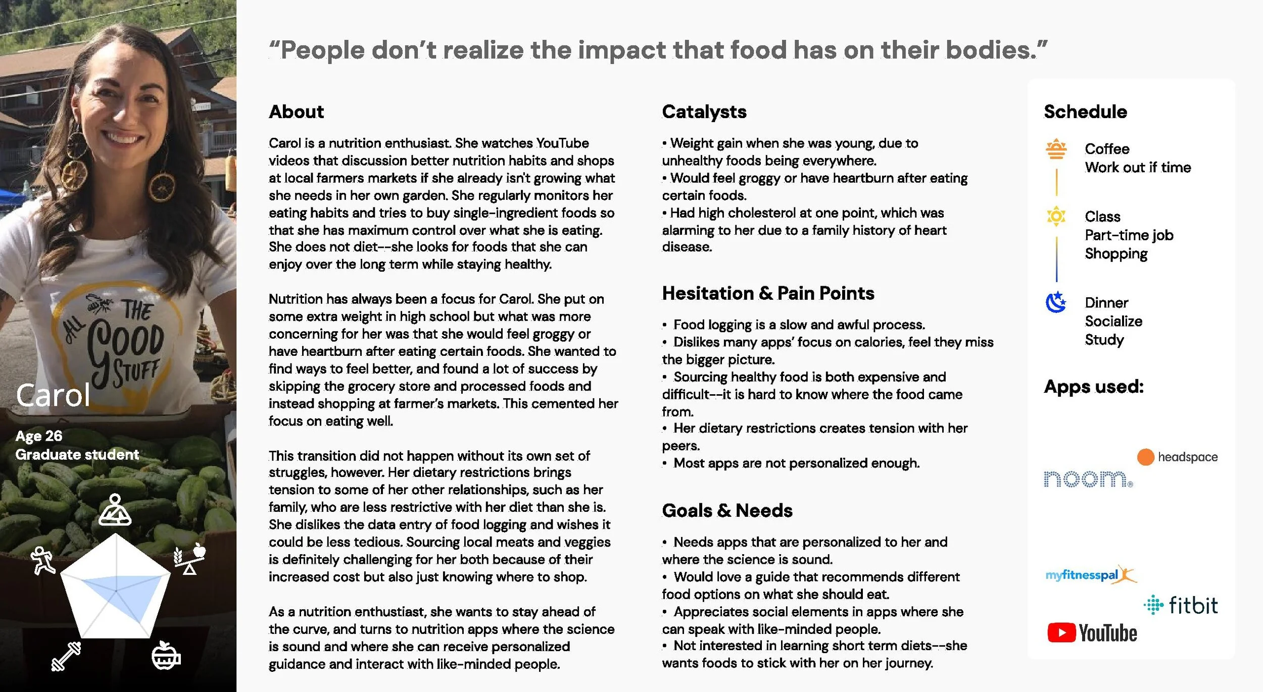
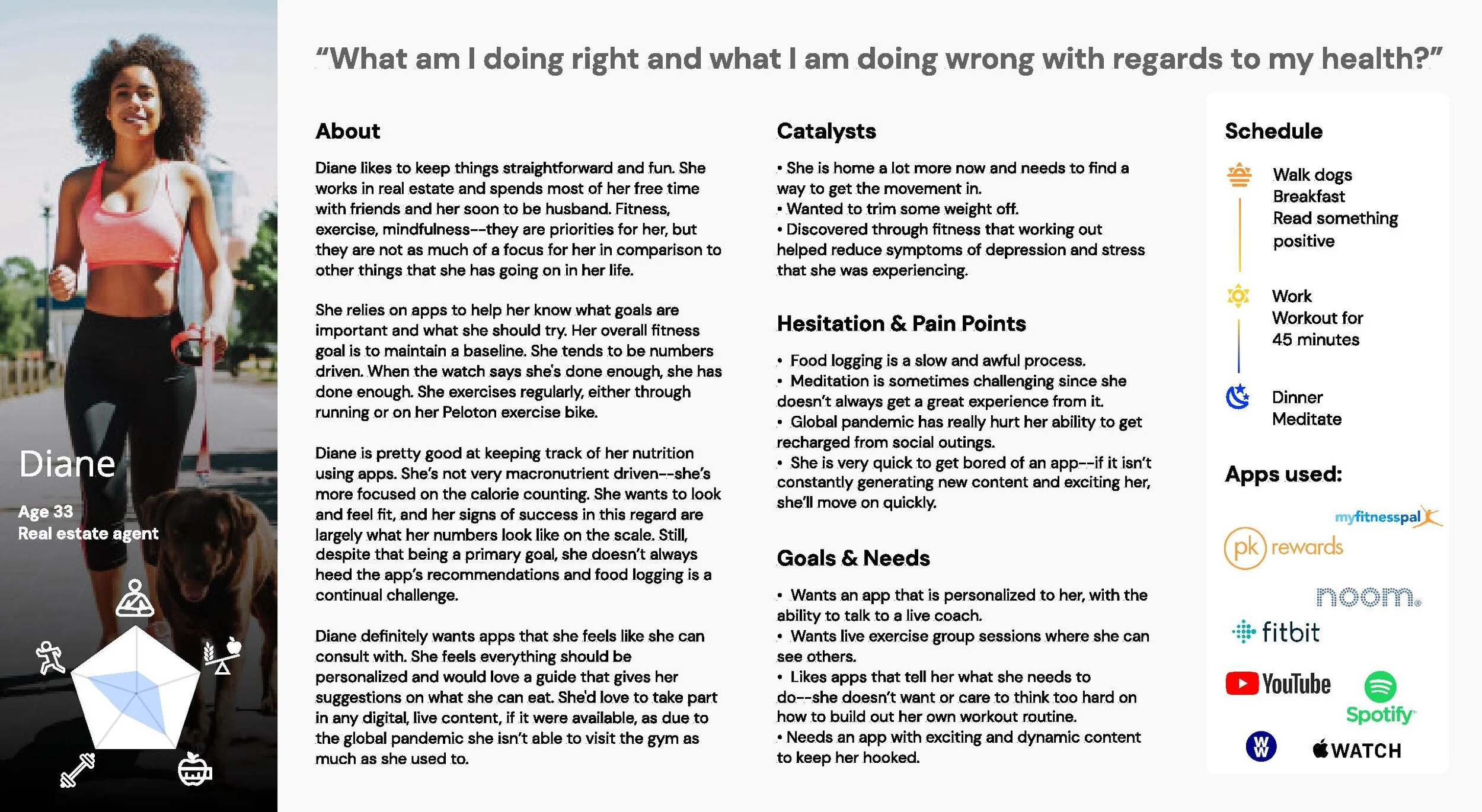
This was targeted at the US and North American market. We listed a Craigslist ad with a cash incentive in exchange for an interview, and shortlisted 25 of 150 respondents across the SF Bay Area, Seattle, Chicago, Ann Arbor and Atlanta. We deliberately filtered out anyone who was only there for the cheque, or whose answers came in single words.
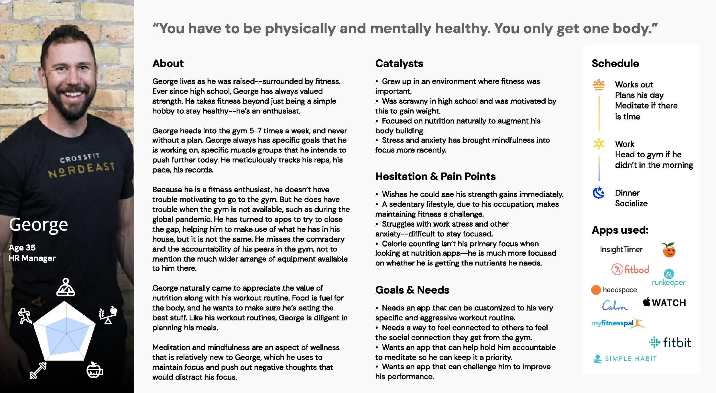
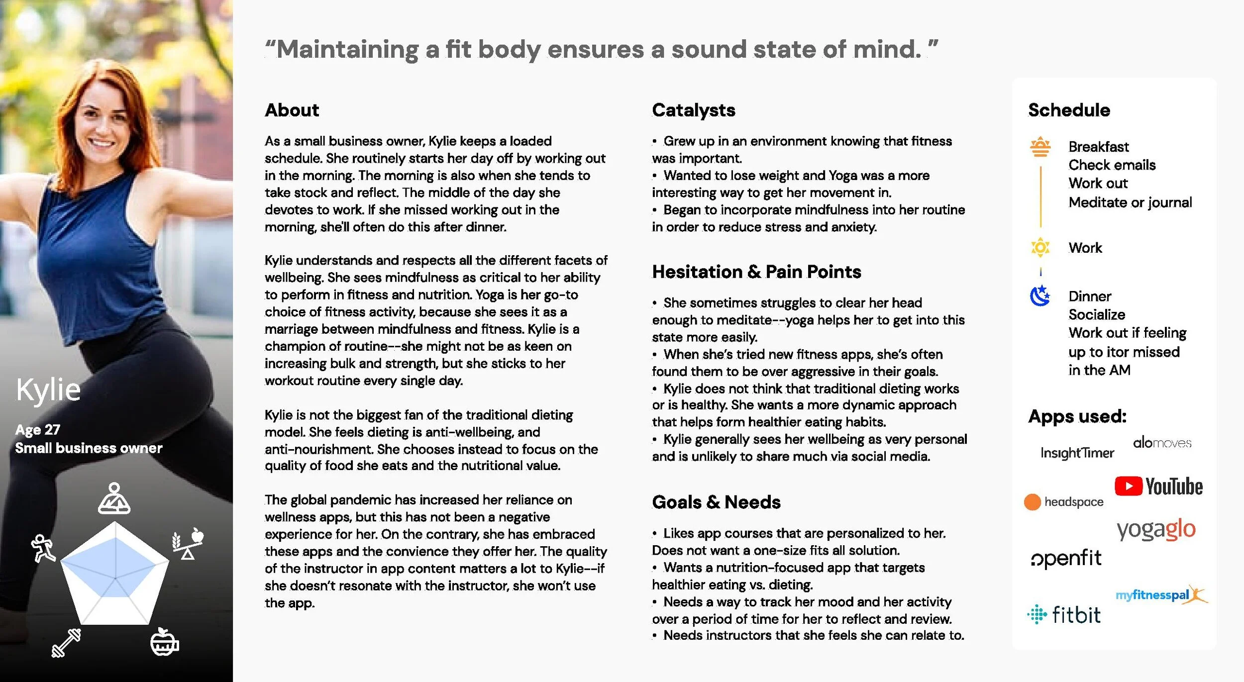
Four personas emerged from those interviews: Carol, Diane, George, and Kylie. Working professionals, 22 to 50, smartphone- (and often smartwatch-) owners, with the intent to get healthier but no clue where to start.
The ten commandments we wrote for ourselves
Before we drew a single screen, the team agreed on a list of quirky principles that we’d refer back to throughout the design process.
- Fight for the user. Always.
- Two large CTAs per screen, maximum. If a screen needs more, the screen is wrong.
- No horizontal scroll, unless intentional and obvious.
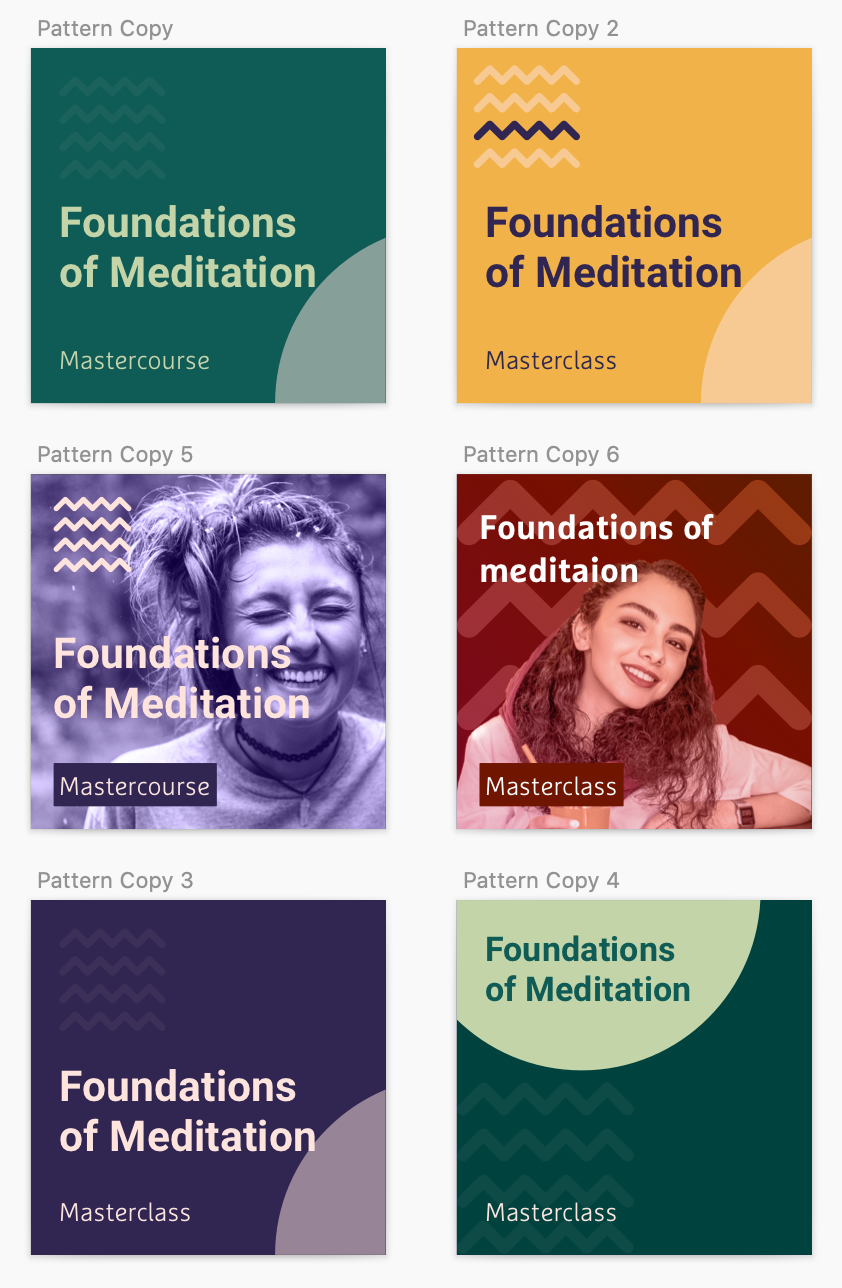
- Photographs over illustration. This is a product about real bodies.
- 8px grid, 16px minimum spacing. No exceptions.
- Design once for both platforms. Modify only the native gestures.
- Eliminate unnecessary text. The button is the documentation.
- Two levels of navigation, then a return to home.
- Delight in the corners: music, notifications, micro-interactions.
- Test. Then test again.
Process
Information architecture, drawn and re-drawn
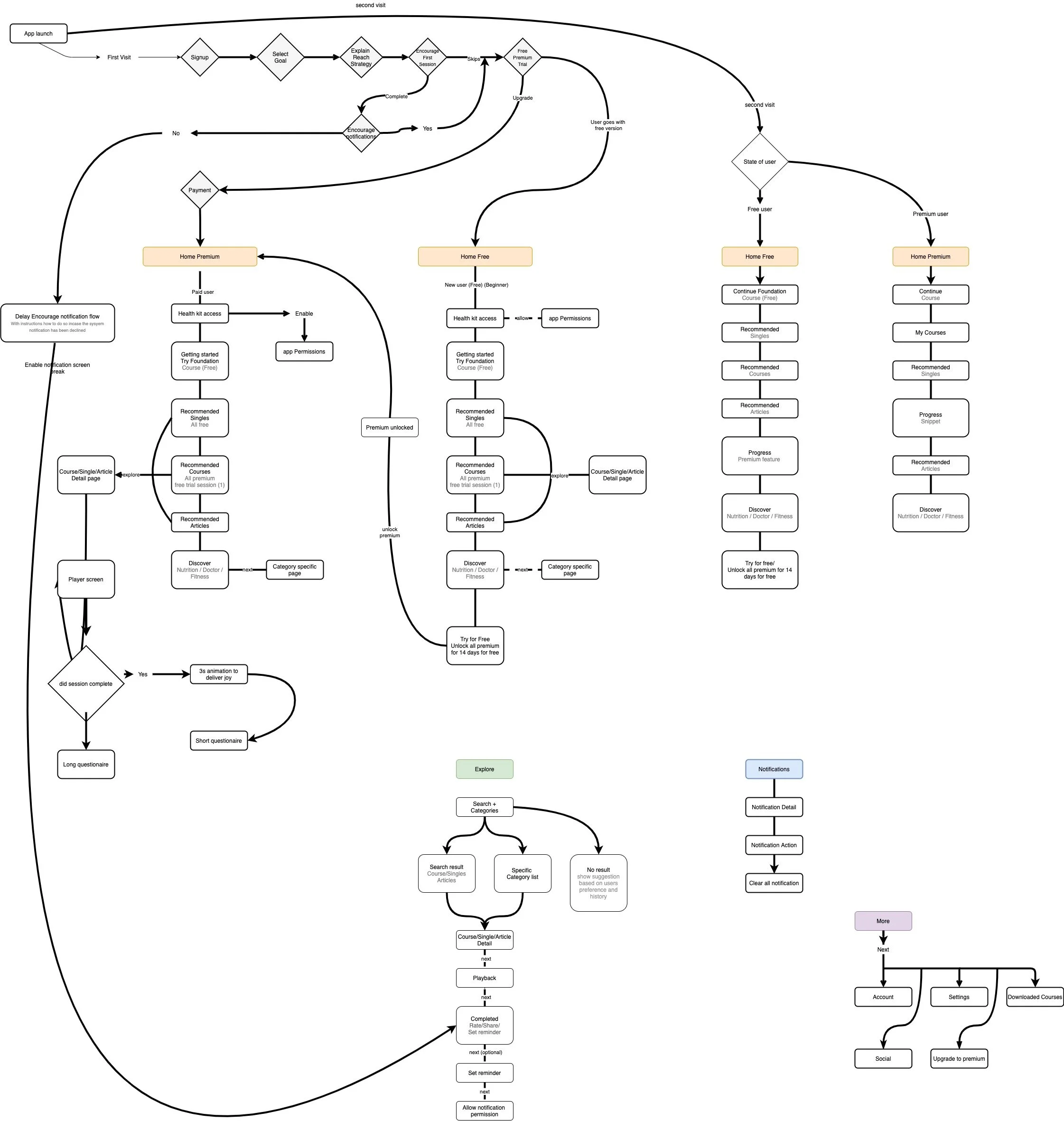
We mapped user journeys and built flow diagrams to scope the work and protect timelines, but treated flows as volatile, not contracts. They were the conversation, not the answer.
Crazy 8s, daily, for weeks
Every day, all five of us:
- Talked the problem out loud, casually.
- Wrote a tight problem statement on the board.
- Sketched for two minutes per quadrant, alone.
- Re-grouped, pinned, argued, kept the best two ideas.
- Developed those ideas into detailed flows that handled the unhappy paths.
The cadence mattered more than the sketches. Showing up daily, in lockdown, kept five designers in five different timezones from drifting in five different directions.
Testing with whoever would answer their phone
The pandemic killed our recruitment plan, so we tested prototypes with family. My parents, my wife, a brother-in-law in Pittsburgh. A design only shipped if four out of five users got through the flow without help.
We would have killed for in-person sessions. You read users better in person. The pause, the lean-in, the moment they stop trusting the screen. Video calls flatten all of that.
A component library, governed by Friday
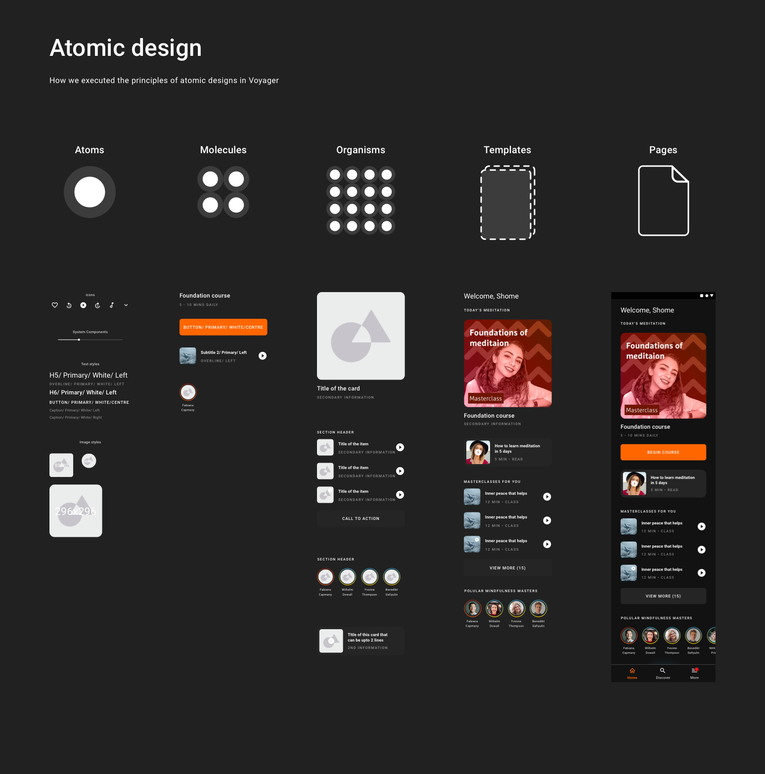
Atomic design, but with humility about how often atoms get recycled by the wrong molecule. We met every Friday to triage new components, deprecate the ones nobody used, and merge the variants that had quietly multiplied. Our NPS for the visual system landed at 4.1 against a target of 4.5. Close, but we had work to do.
And now, the designs
Splash and onboarding
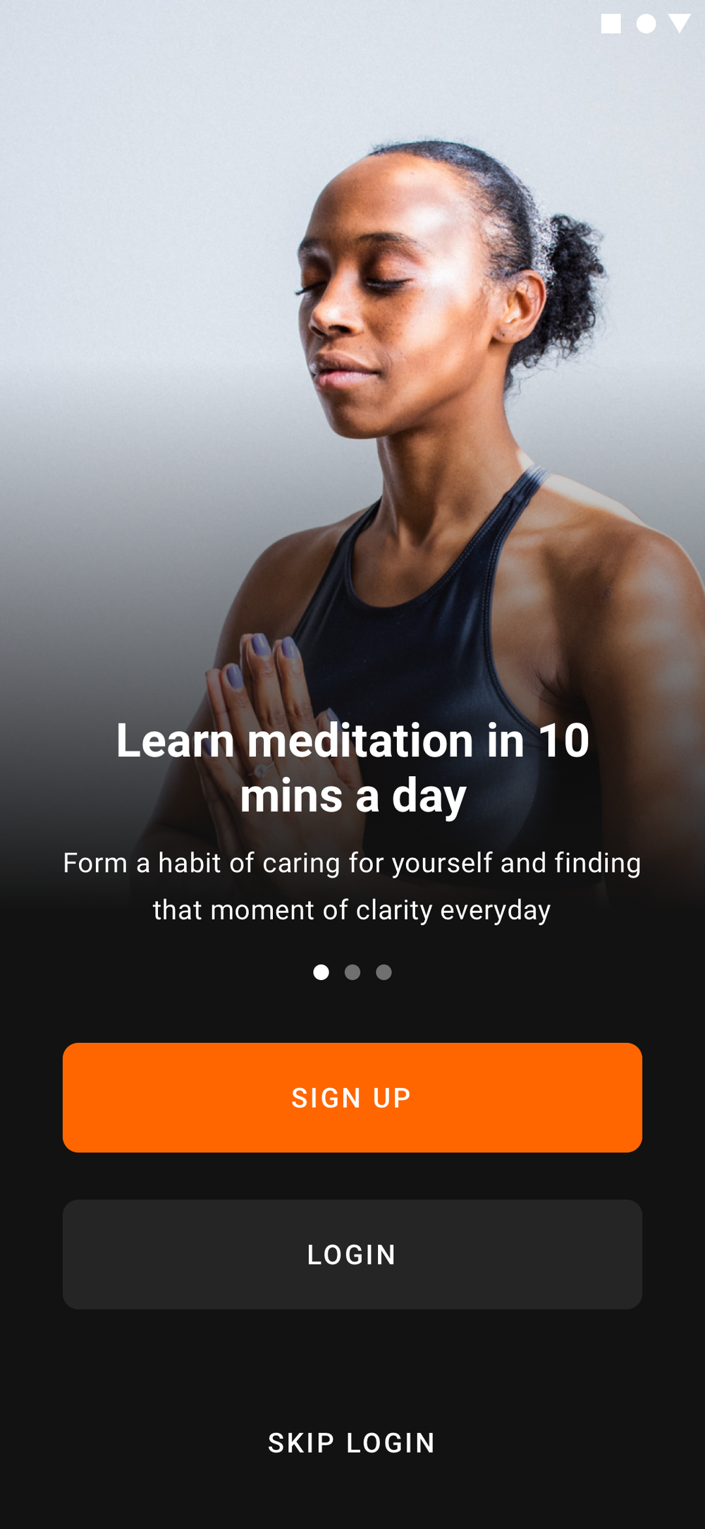
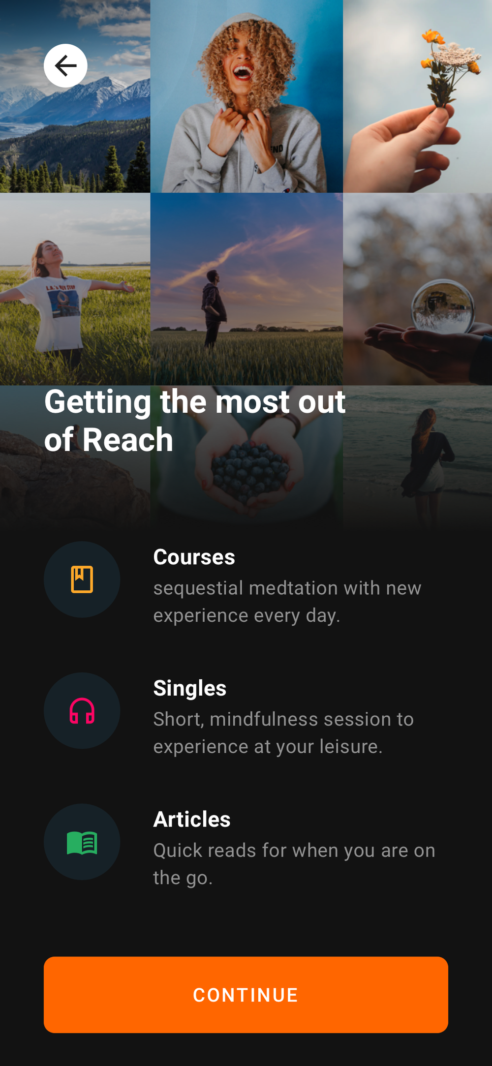
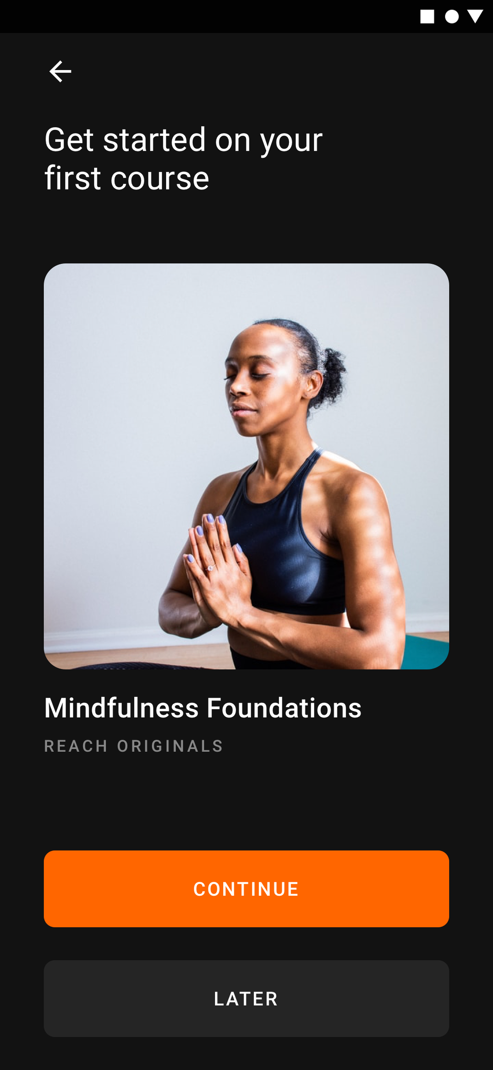
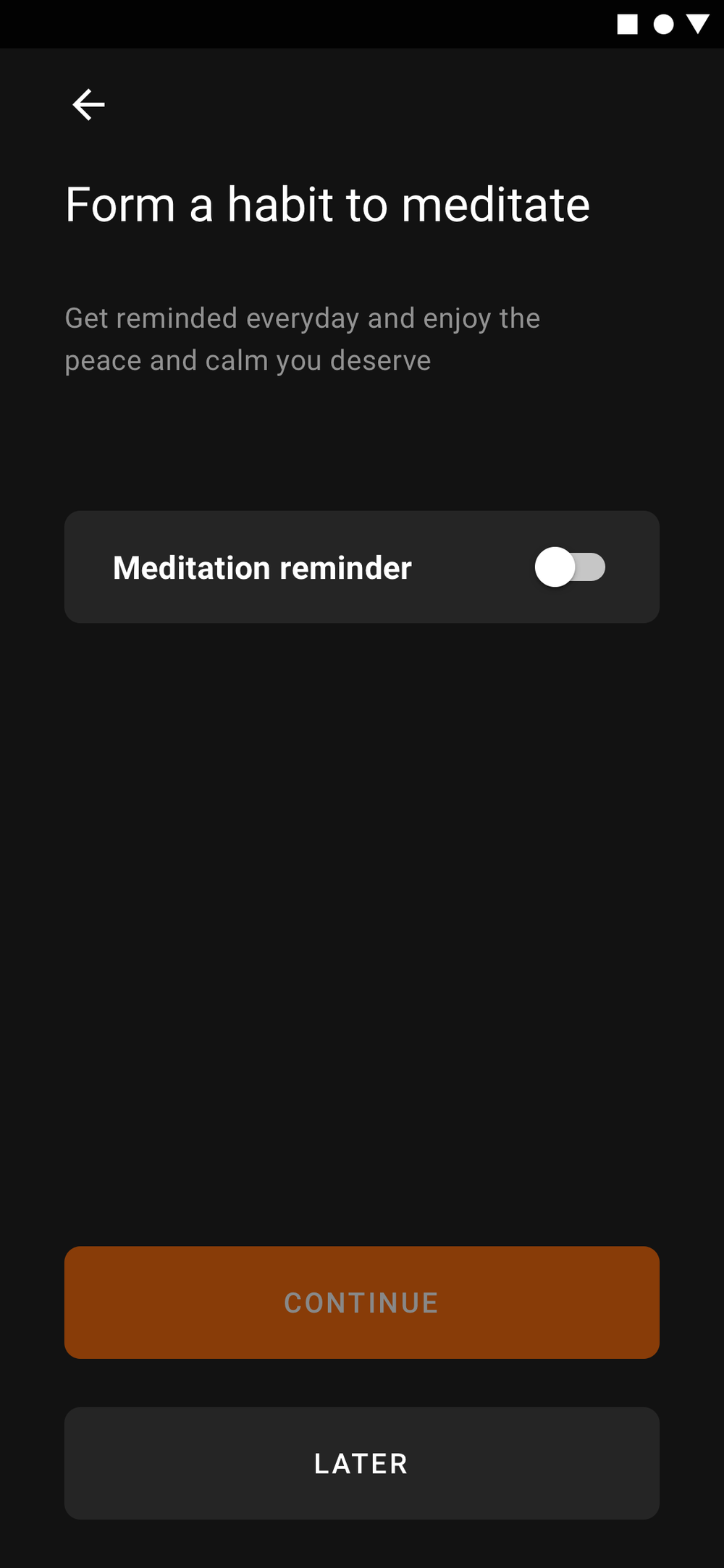
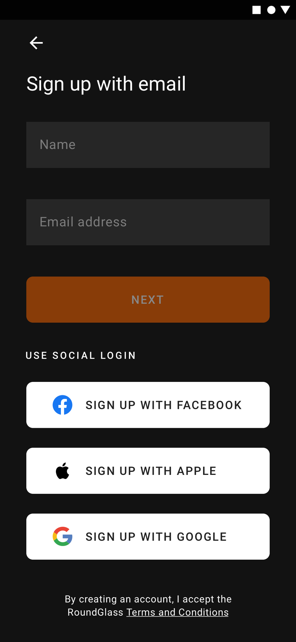
The user lands on a splash, walks through a four-screen onboarding (skippable, with deferred gates), and lands on the home screen ready to meditate.
Home, evolving
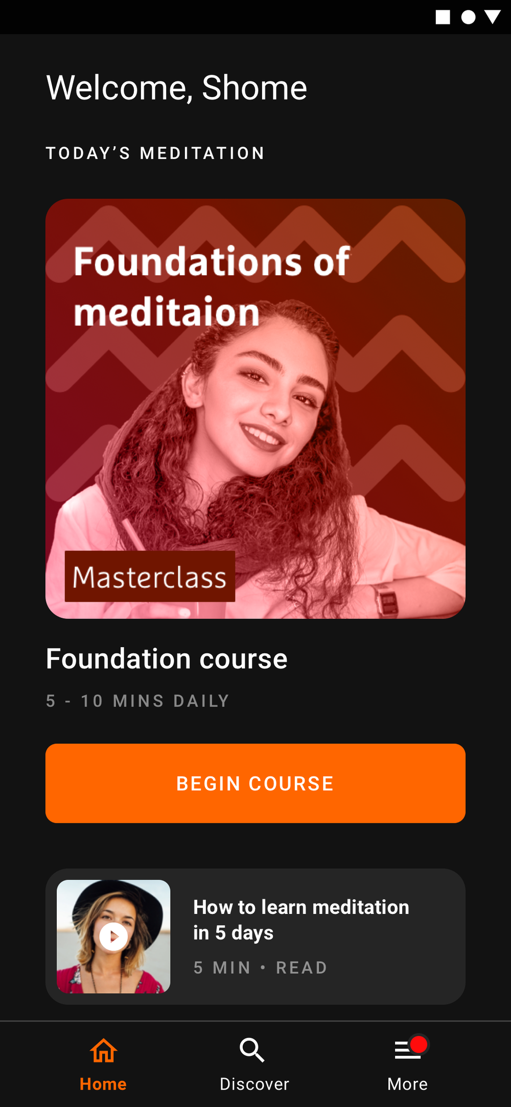
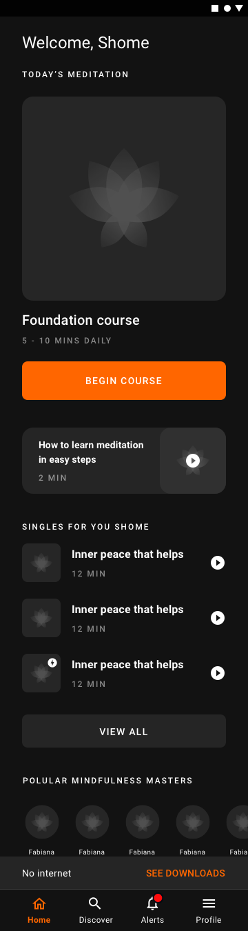
The longer you use the app, the more the home reshapes itself around what you actually do. New users get curation; returning users get themselves.

Discover, search and the player
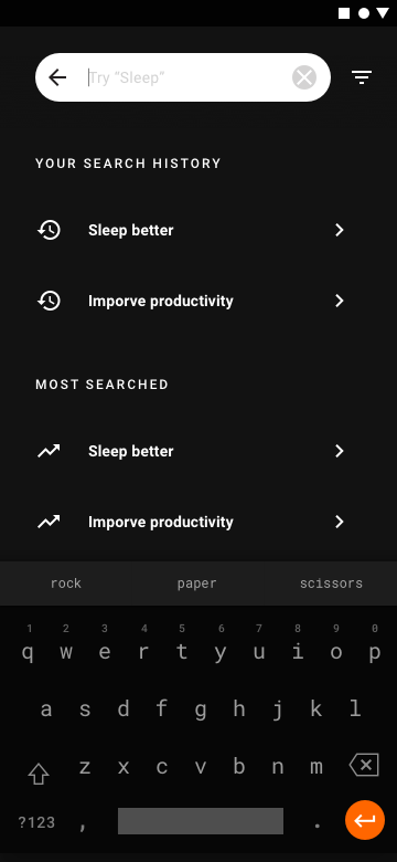
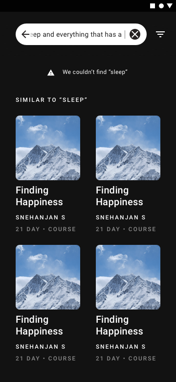
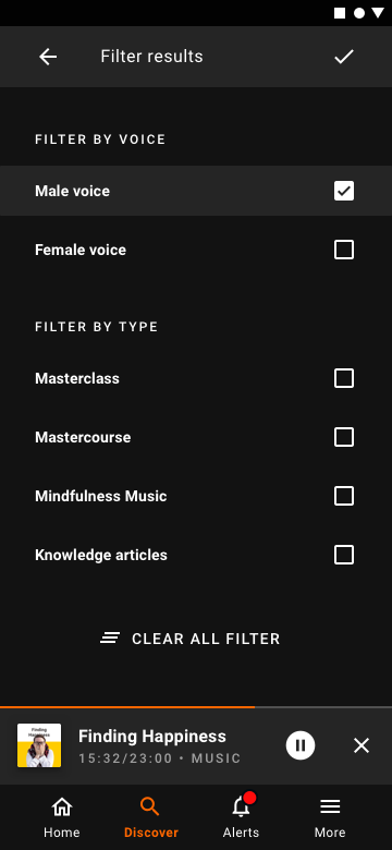
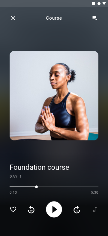
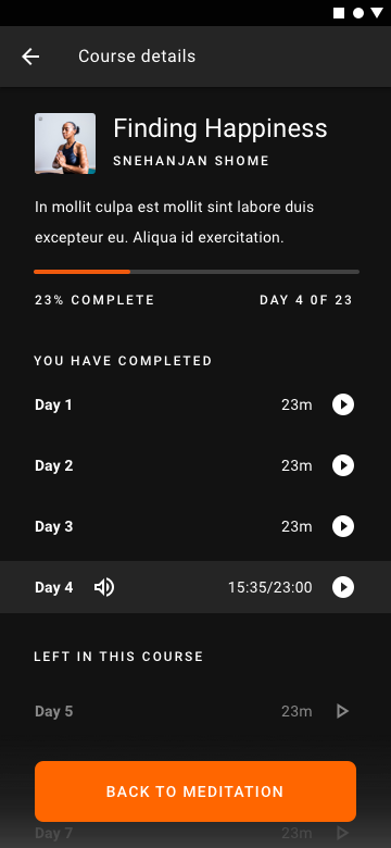
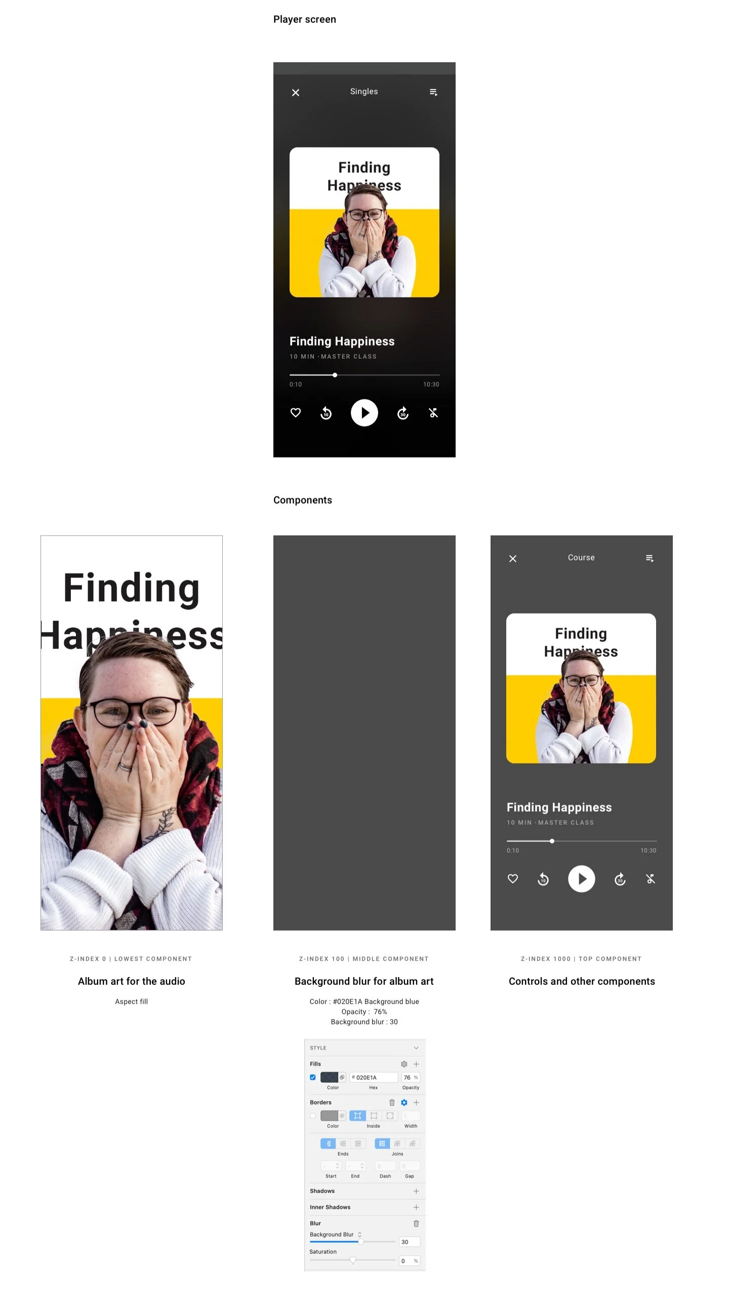
A discover surface, a search with history, no-result and filter states, and a course player that collapses and expands without leaving the screen.


Mini-player, profiles, downloads
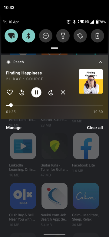
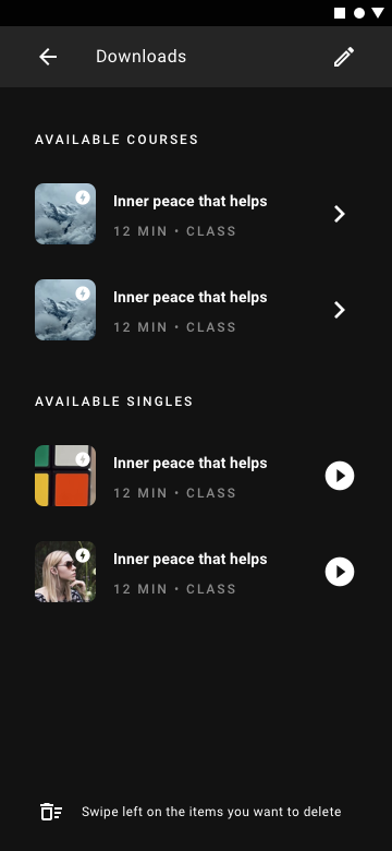
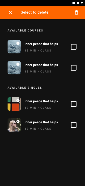
A mini-player that survives every screen, a teacher profile that reads like a story, and a download flow with multi-select. Borrowed politely from Spotify; nobody complained.

The other stuff
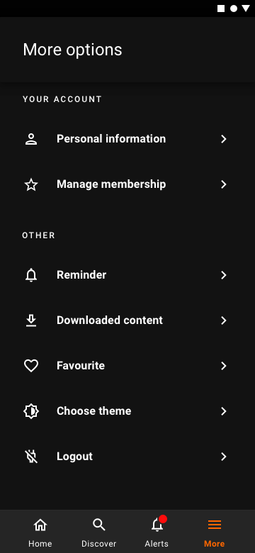
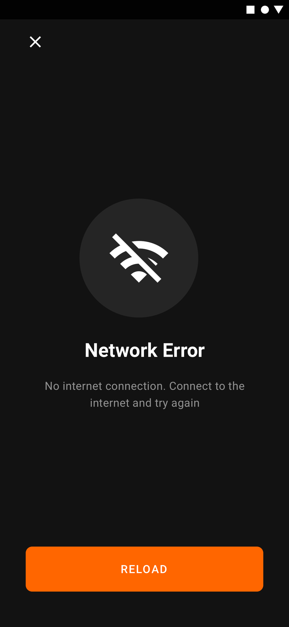
The screens that make the app usable. Knowledge details, the more menu, a small-phone fallback, and an honest network-error state.

Why a meditation app is dark
Most people meditate in the dark. Beginners peek at the screen. Bright phones break the spell. We heard this loudly during Aware, again in Reach app-store reviews, and built Voyager to default to dark, or honour the system theme if the user wanted otherwise. Dark mode happens to be trending; that helped sell it internally.
Designing for the handoff
Engineers don’t always see designs the way designers do. We detailed components in Zeplin, ran two formal check-ins a week, and stayed available for the impromptu “is this margin 16 or 24?” questions in between.
Live, in private beta
Voyager launched in private beta on the App Store and Google Play. Meditation shipped first; the other four verticals followed on the roadmap.
Lottie was the unlock
A footnote, but a fond one: most of the micro-interactions in Voyager ship as Lottie JSONs. Small files, big impact, and a quiet peace between designers and engineers. Read the Lottie write-up for the long version.