Product design · 2018
Aware, redesigned
A year after launch, fixing what the weekend prototype had quietly carried forward. Reachability, dependencies, and a meditation app that could actually be looked at.
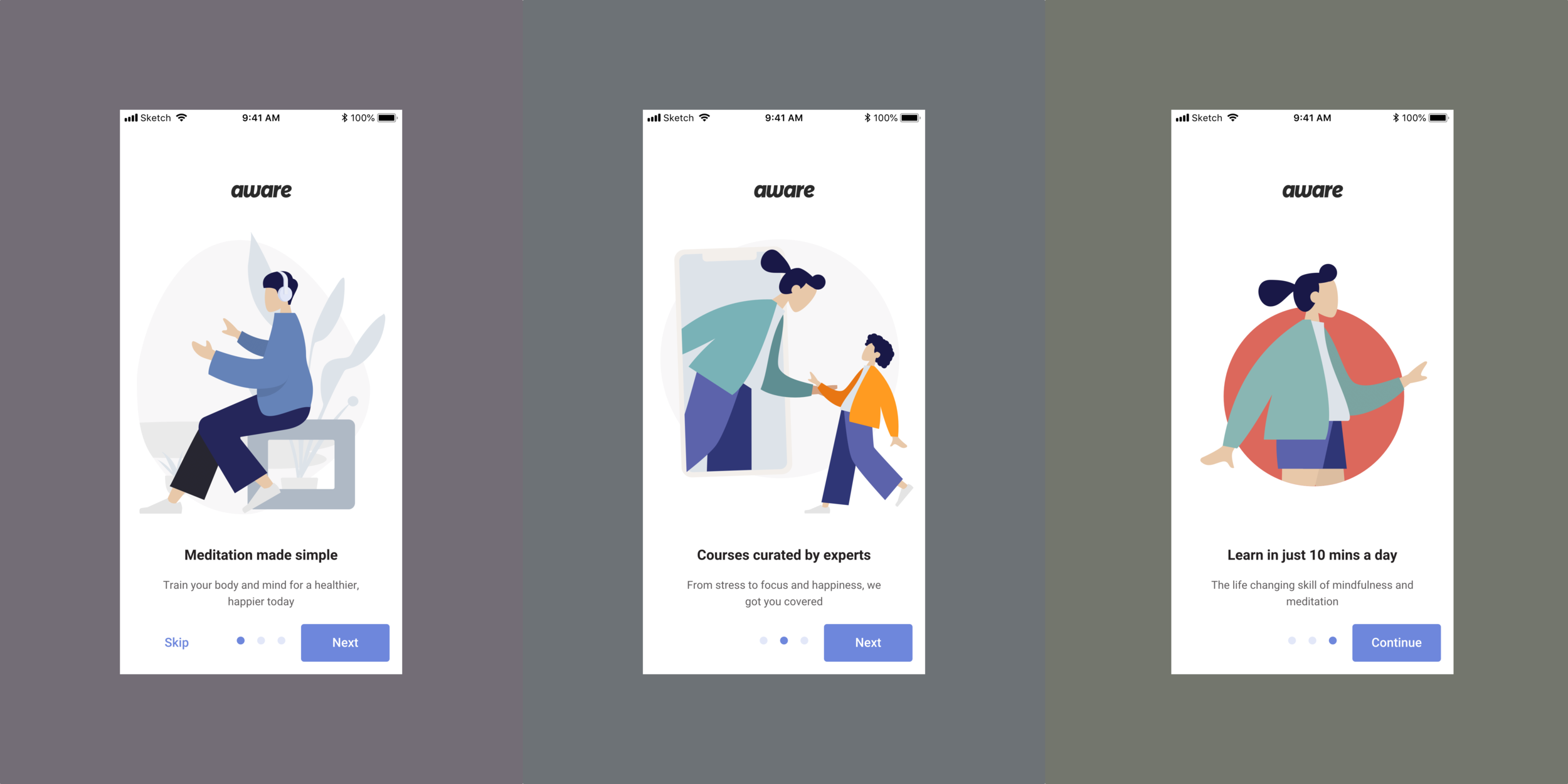
Aware UI Redesign, 2018.
Aware shipped its first build as a weekend prototype. The plan had only ever been to test the concept of a guided-meditation app with a baritone master voice. The prototype quietly turned into the production app, and by the time we were thinking about the redesign, a year of users had been living on Saturday-morning visuals. This sprint was the cleanup pass.
Why the redesign mattered
During the prototype phase, we wanted to test out a bunch of assumptions and understand the market fit. We ran A/B tests on master voices, on a few UX flows, on a couple of layouts, and on some business strategies on for size. By the end of the first year, we’d documented a list of the things the original design had quietly been getting away with. This sprint was the list.
In raw terms: 27 courses and 50 Singles had shipped during that first year. Each one came with its own release-week scramble. The redesign had to address that, plus four other things the data and the inbox were both telling us about.
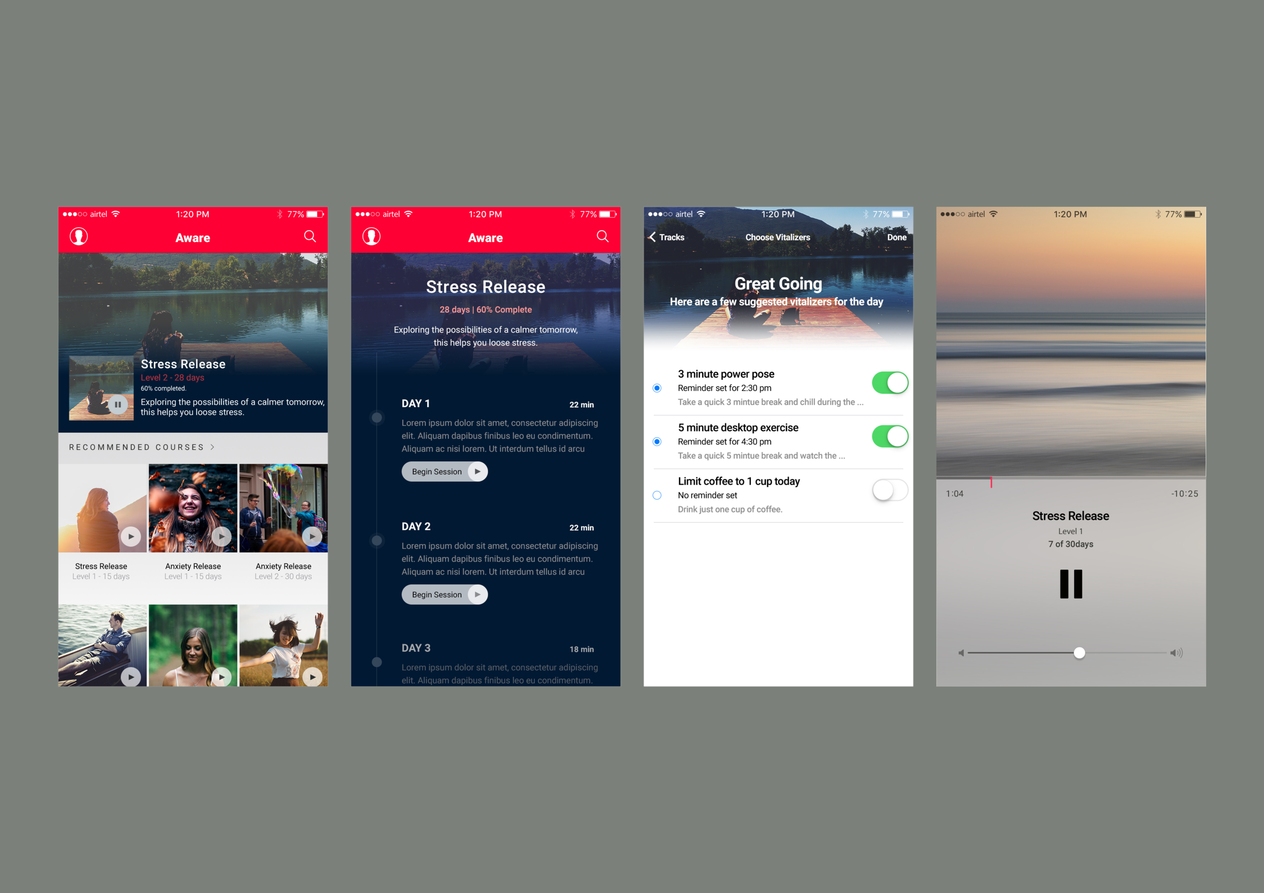
Five issues we were going to fix
1. Minimise internal dependencies on each team
During the test period, we released about 27 courses and 50 Singles. The release process had too many variables and dependencies across teams: collateral and assets, content review, marketing assets. We wanted to minimise dependencies by templatising the approach. Fewer custom moments per release, more shapes the team could fill in without a meeting.
2. Address the 18:9 phone reachability issue
In 2017 a new, taller display became insanely popular among new phones. With it came a new challenge: reachability. We wanted to make sure our users could use the phone one-handed. In the previous design, the call-to-action buttons were placed toward the top of the screen. On the new 18:9 phones, that turned into an issue. Engagement dropped meaningfully on those phones. The fix was to re-anchor the primary actions toward the bottom of the screen, where the thumb actually lives.
3. Ability to take multiple courses
In the previous design, we’d mandated the Foundation course that taught the basics of mindfulness. Many of our users had been meditating for a while, or wanted to start with something more focused, without going through Foundation first. We ran an opinion survey: 82% of users wanted the ability to take two or more courses in parallel. So we let them.
4. Improve the engagement of Tools and other features
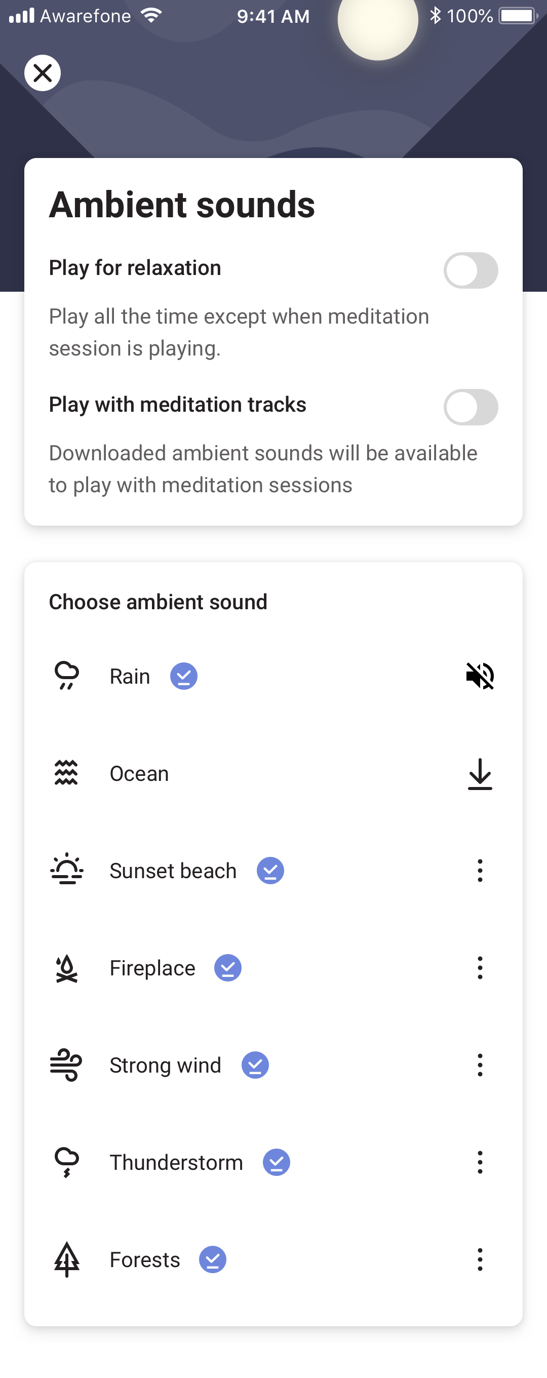
We noticed a correlation in the data: users who tried Ambient sounds and Breathe were significantly more likely to subscribe to Aware (monthly or yearly). A push toward these features would have helped conversion on the subscription pages. They were also the features that took the most clicks to find. Surfacing them earlier and more consistently was the cheapest design intervention available.
5. Make the designs aesthetically pleasing
Aesthetic designs are considered better designs.
Dieter Rams
We noticed a bunch of inconsistencies in the previous design and wanted to build on them to make them pleasing, aesthetically. The previous version of the app was meant for quick prototyping. It was shipped within a weekend to test our ideas. We’d barely given the visuals any thought. This pass was the chance to make the visuals deserve the practice.
What got designed
Onboarding
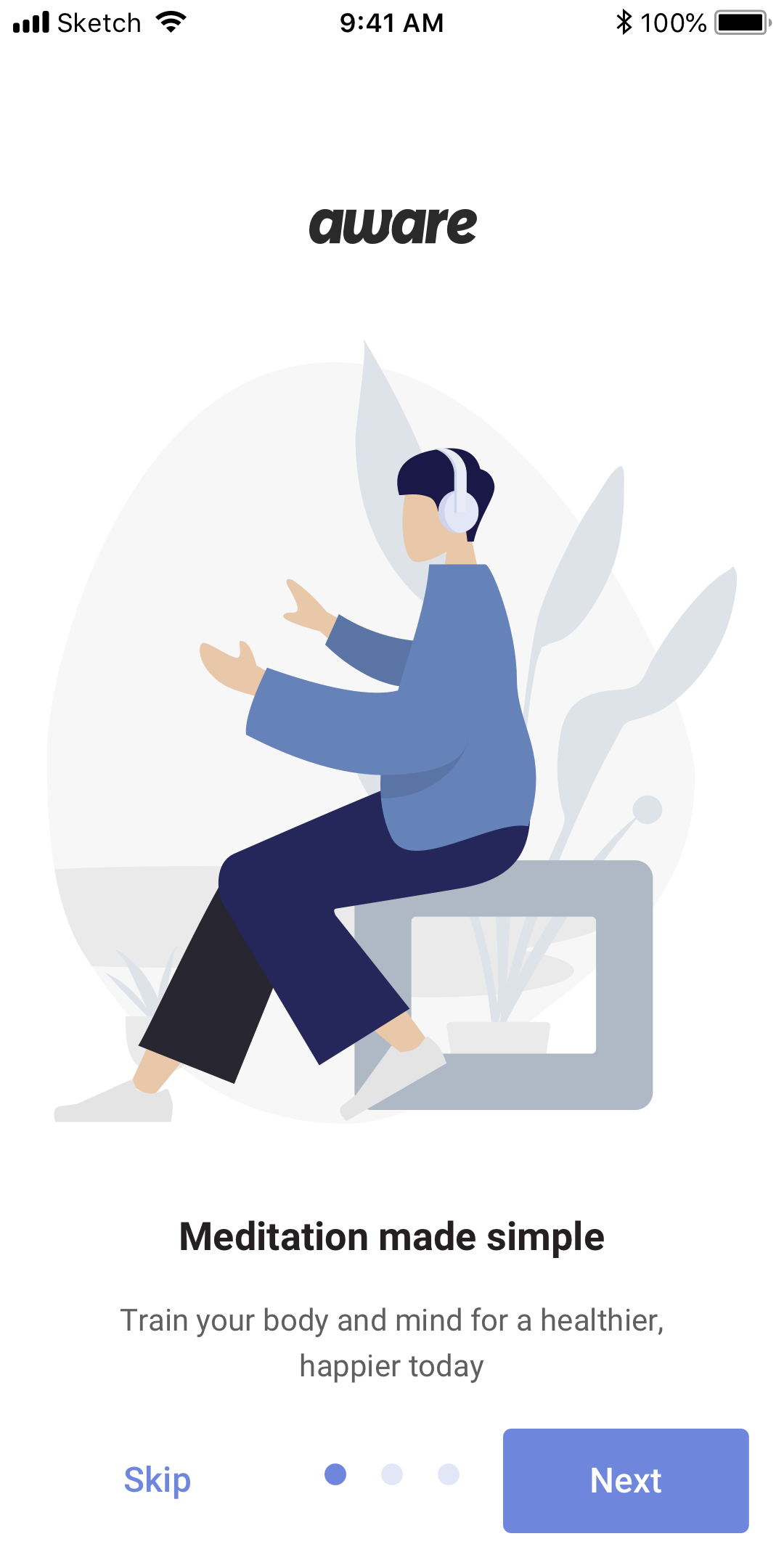
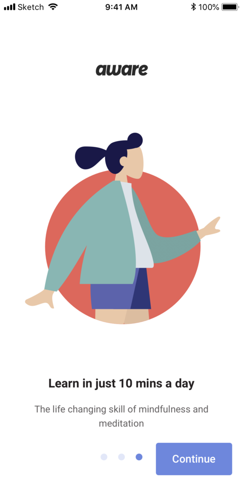
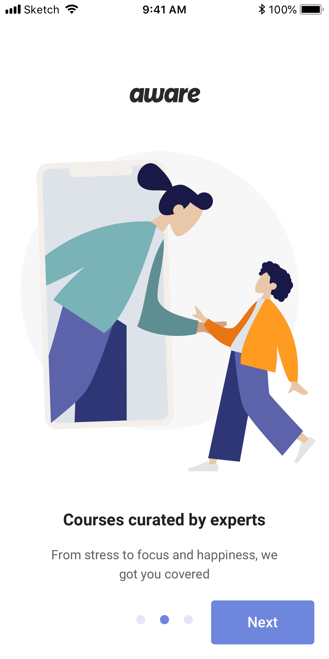
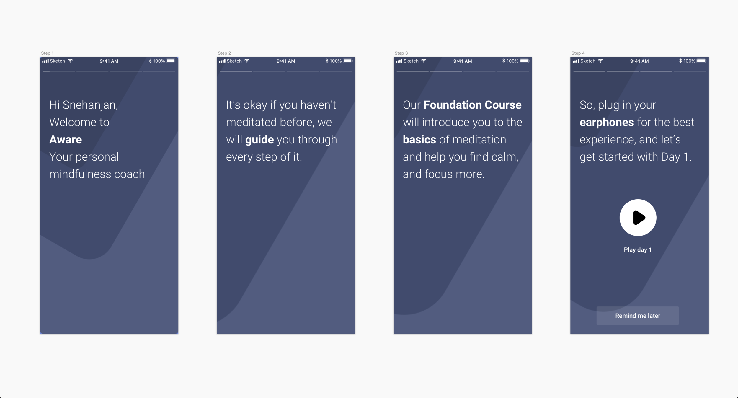
The four-screen onboarding got rebuilt with clearer flow and stronger illustration. We used the Humaaans library by Pablo Stanley as a starting point, kept the palette anchored to the Aware brand colours from the initial research & branding work, and made the whole flow skippable for returning users.
Sign-in, sorted by what people actually used
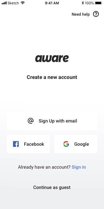
Sign-in options got re-sorted by frequency of use on iOS, so the most likely path was the path the screen suggested. Small change. Compounding effect on first-session completion.
Homepage and the Shelf
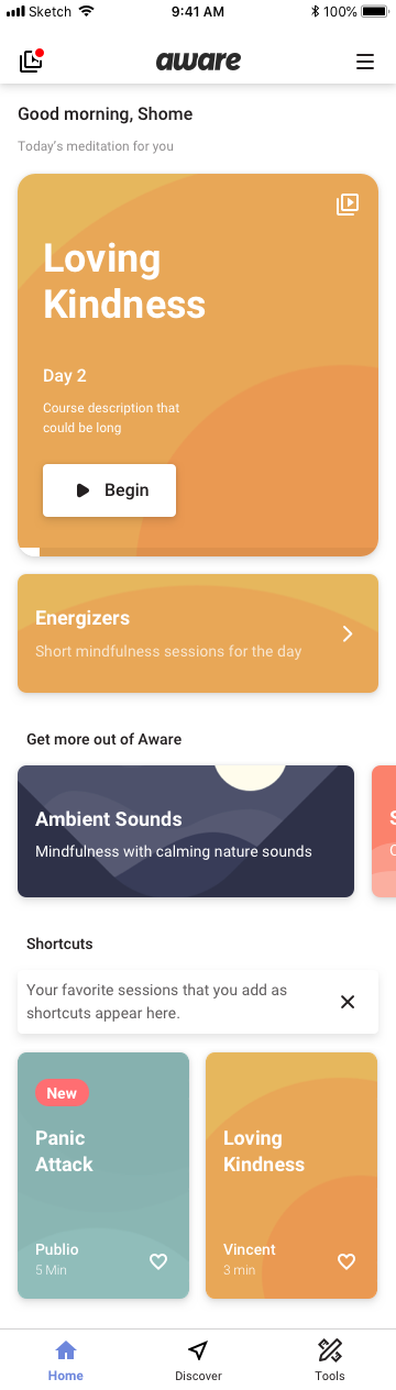
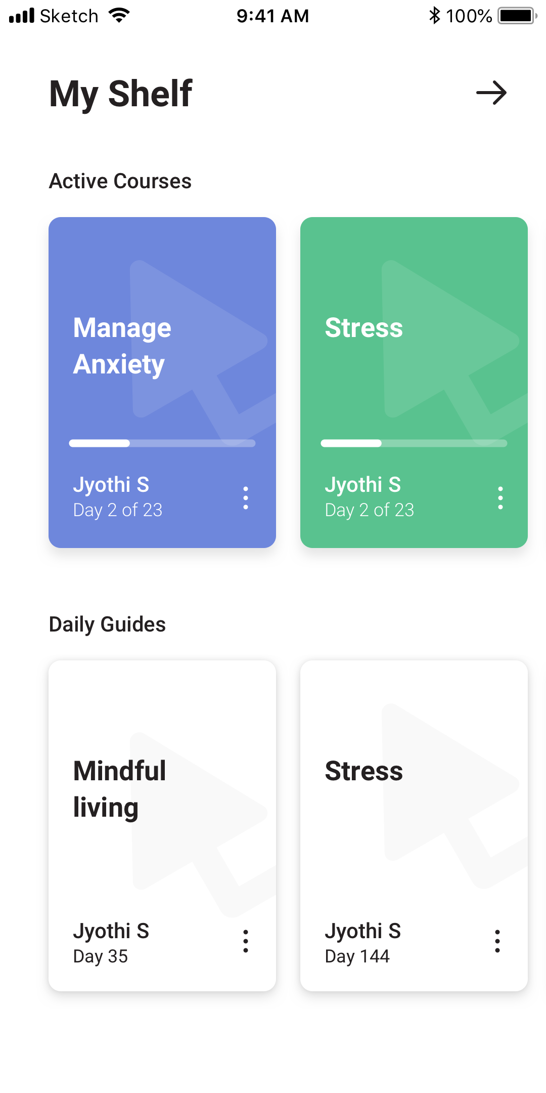
The Shelf held the user’s active courses, so the homepage didn’t need to remember everything you were halfway through. Once you started a course, it sat on your Shelf until you finished or abandoned it. Quietly the best storage idea in the whole redesign.
The player, Singles, and Ambient sounds
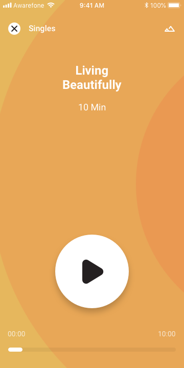
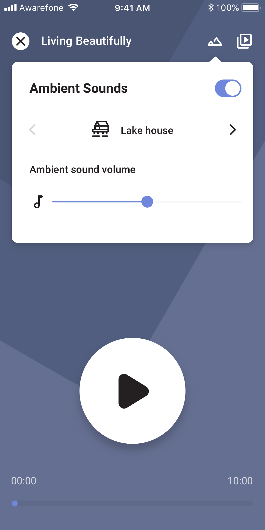
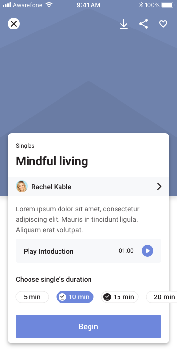
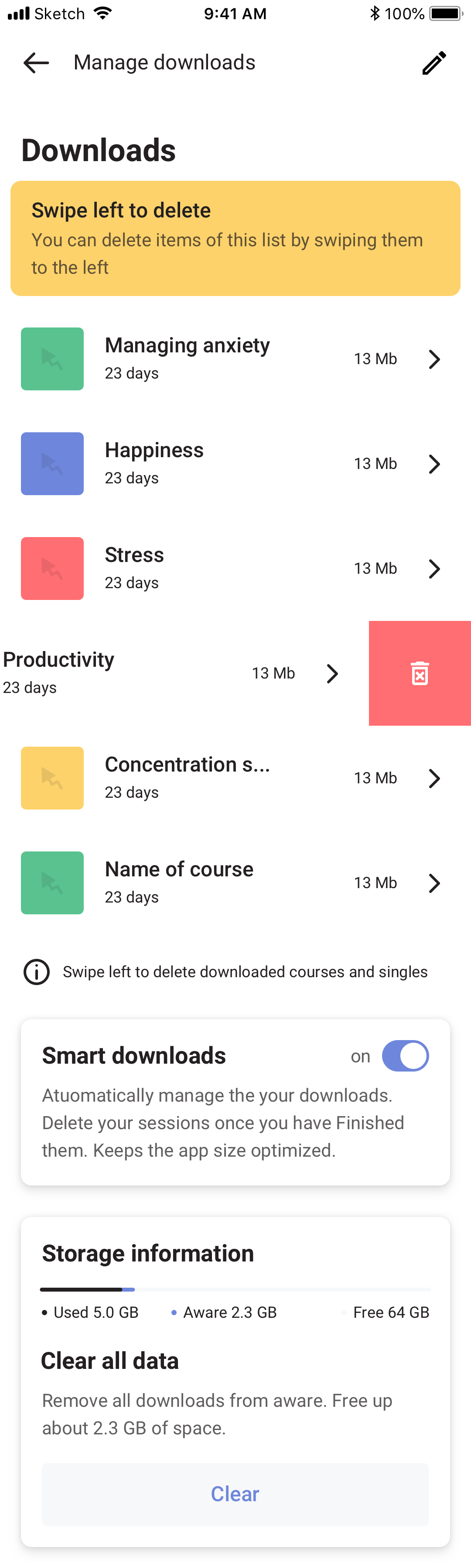
A player redesign with Ambient sounds sitting alongside guided meditation. The long silences that broke the spell for new users got covered by a quiet acoustic bed they could toggle on or off. A Singles details screen for the standalone tracks, and a gesture-based list for navigating between them quickly.
Profile and subscription
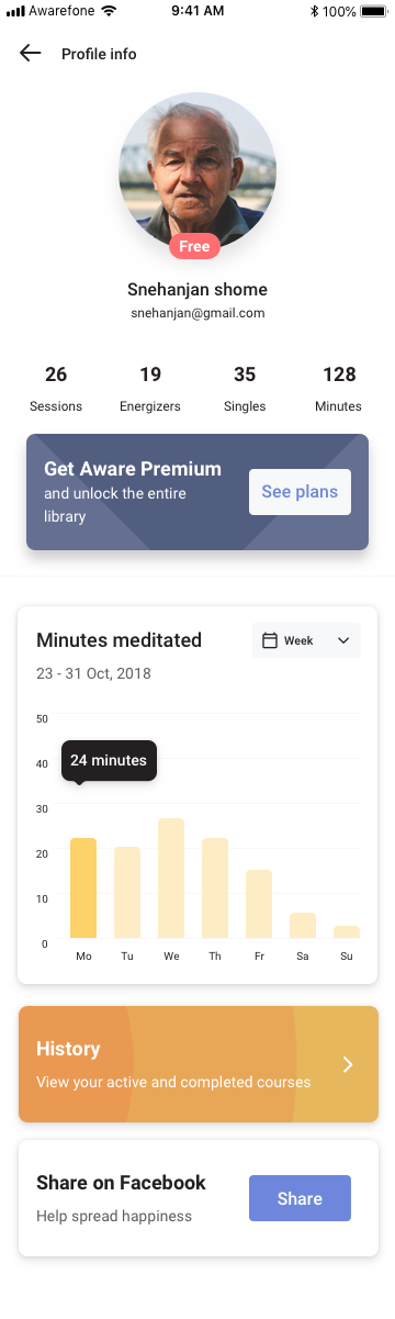
Profile screens carried a quiet, contextual prompt to upgrade. Not blocking. Not flashing. Just present, where someone actively engaged with the product would naturally see it.
And then it didn’t ship
Aware was acquired before this version of the app could go out.
The work fed into Roundglass Reach, and two years later much of the same thinking came back around in Voyager. The dark default. The lifecycle-aware structure. The bias toward fewer screens that worked harder. The conviction that Ambient sounds matter more than people think they do.
Some projects ship. Some projects become other projects. Both count.
The dream still lives on as Roundglass Reach.