Research · Identity · 2018
Aware: research & branding
Before any of it shipped. The weekend hackathon that became a meditation app, and the colour study that taught us how to make it look like itself.
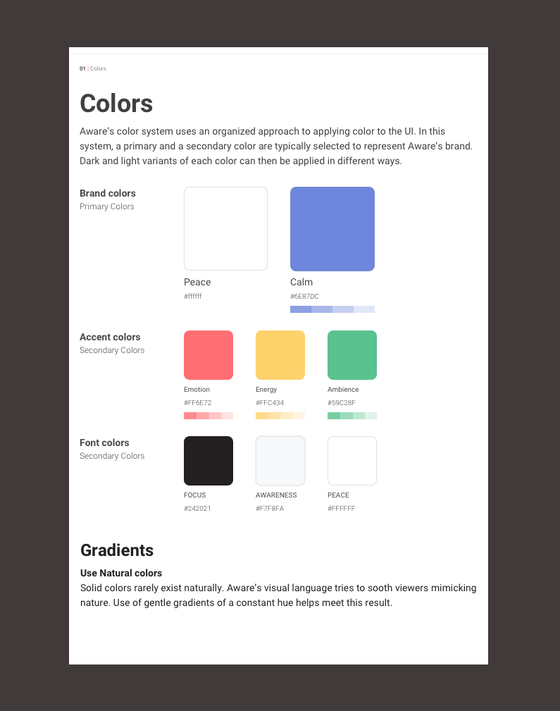
Aware UI colour exploration & branding, 2018.
Aware was launched as a proof of concept. We ran a weekend hackathon to design and develop the initial prototype, then stuck with it as the product while Zoojoobe was in the process of being acquired around us. The brief from a Friday afternoon turned into something that ran for the next two years.
What the weekend got us
The original design did its job. It proved the concept worked. It helped us understand whether there was a market for what we were building. We A/B-tested a few master voices and documented which ones held people’s attention, eventually landing on a baritone male voice that felt grounded without being clinical.
What the weekend didn’t give us was a brand. No cohesion across colours. No real story. No intent in the typography. Looking at the prototype after a year of use, the visuals were exactly what they looked like: Saturday morning’s work.
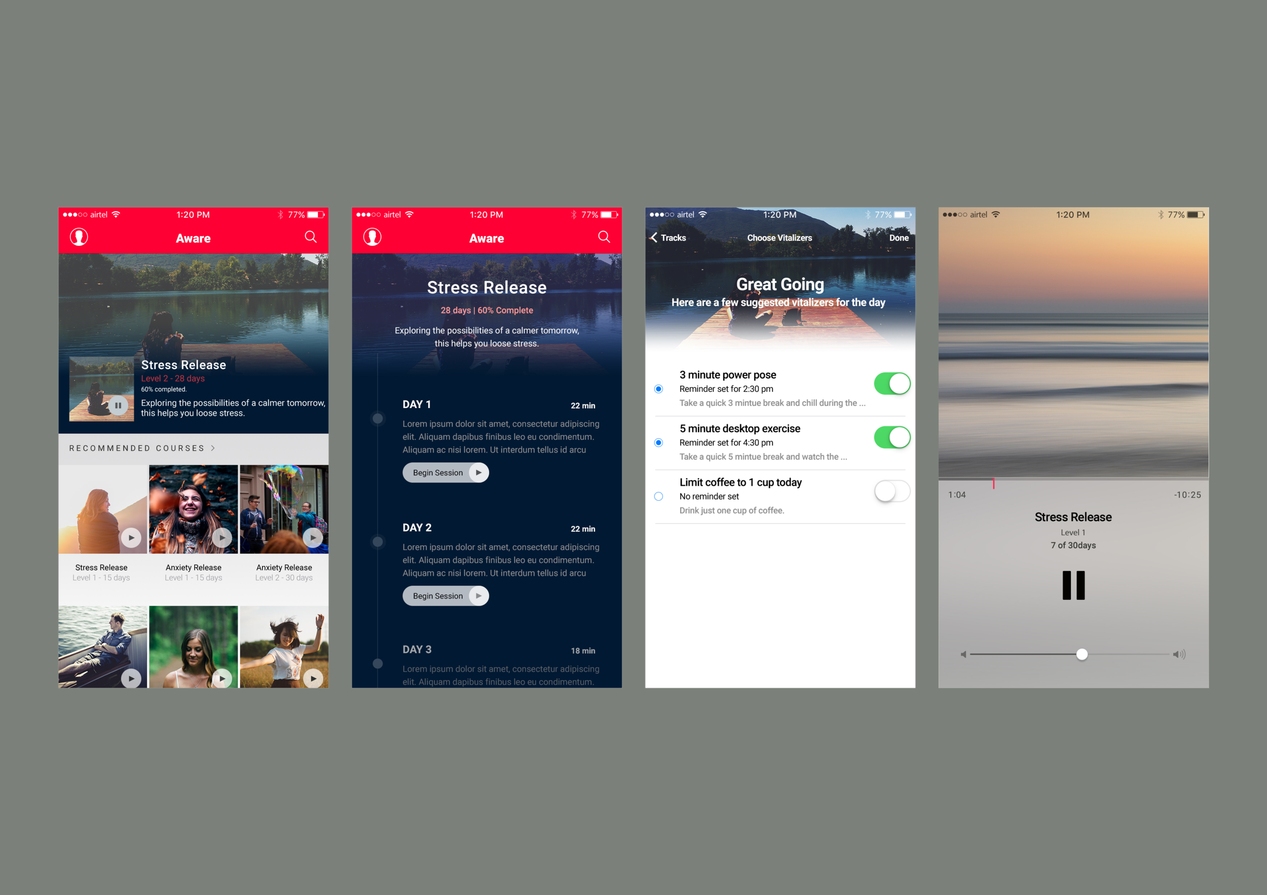
It looked dated. But it shipped, and it taught us what kind of app this needed to be. The cleanup pass came next.
Good design is aesthetic.
Dieter Rams
That quote sat on the wall through the rest of the project, which is the only reason I’m comfortable quoting Dieter Rams at the top of a case study.
The process
I didn’t want to start from a designer’s instinct about what mindfulness should look like. My instincts had favourites. Favourites are not a colour system. Instead, I started by asking the people who’d actually be using Aware, and the people building it, what they associated with the practice.
Step one. Gather the language
We sent a small Google Form to the team and a handful of early users:
“Share five to ten adjectives that you associate with mindfulness meditation.”
Fourteen responses came back. The same words kept appearing across them, not in identical phrasing, but in obvious overlap.
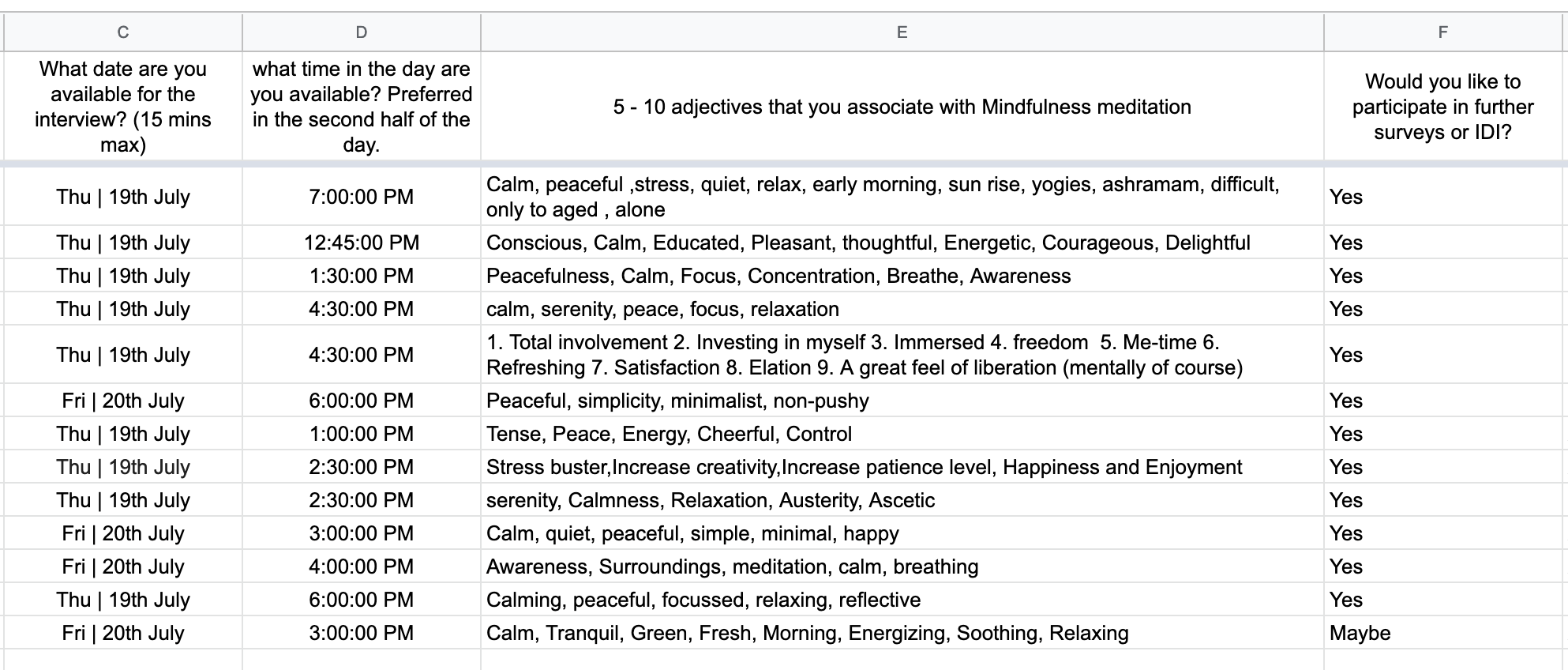
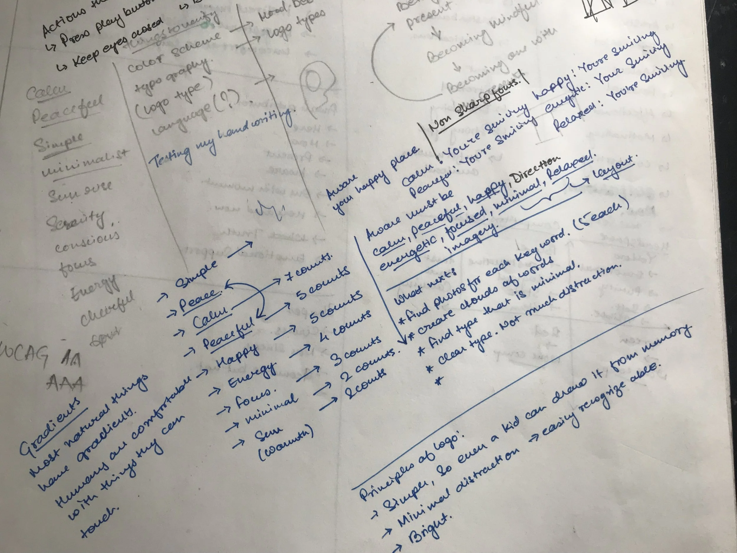
The eight words that survived the clustering:
Peace · Calm · Happy · Energy · Focus · Minimal · Warmth · Environment
That list became the brief. Not a written one, but the test every later decision had to pass.
Step two. Build a mood board against the language
I went onto Dribbble and searched against each of the eight words. Everything that visually agreed with the language went onto a single board.
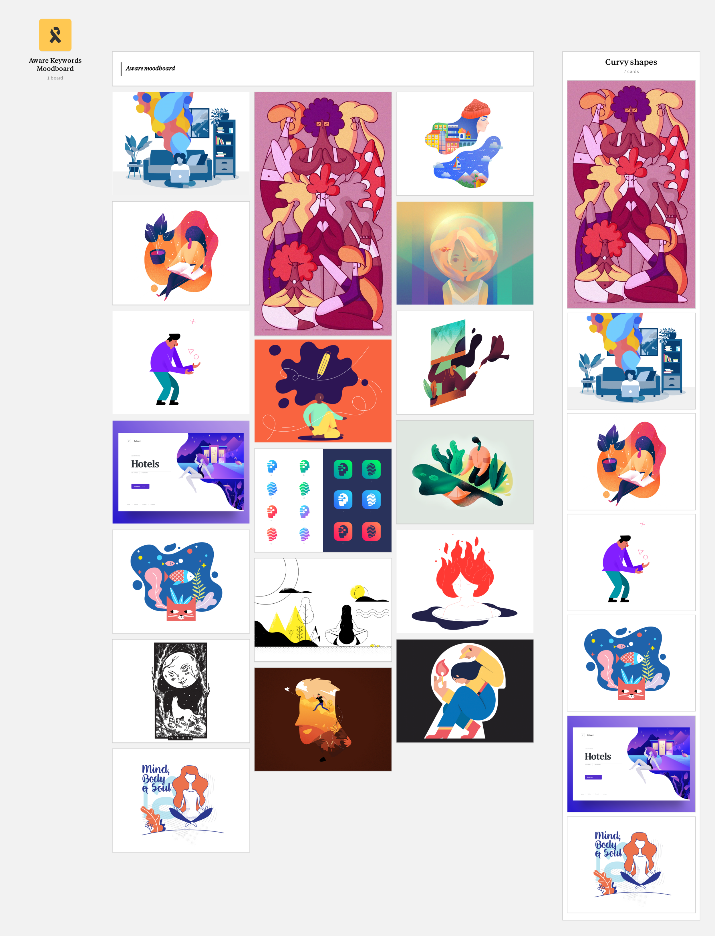
You can see obvious clusters of colour and shape forming inside the board. But here’s the trap: I had taste. If I started picking from this board directly, I’d be picking what I personally liked, dressed up as what the research told me. The board’s job was to be representative; the next step’s job was to remove my thumbprint from the analysis.
Step three. Pixelate, cluster, defend nothing
I took the entire mood board and ran it through a low-poly pixelation. Once the references stopped being recognisable as their original images, the colours did the talking. No more “oh, that Calm screenshot was so nice.” Just clusters of pixels.
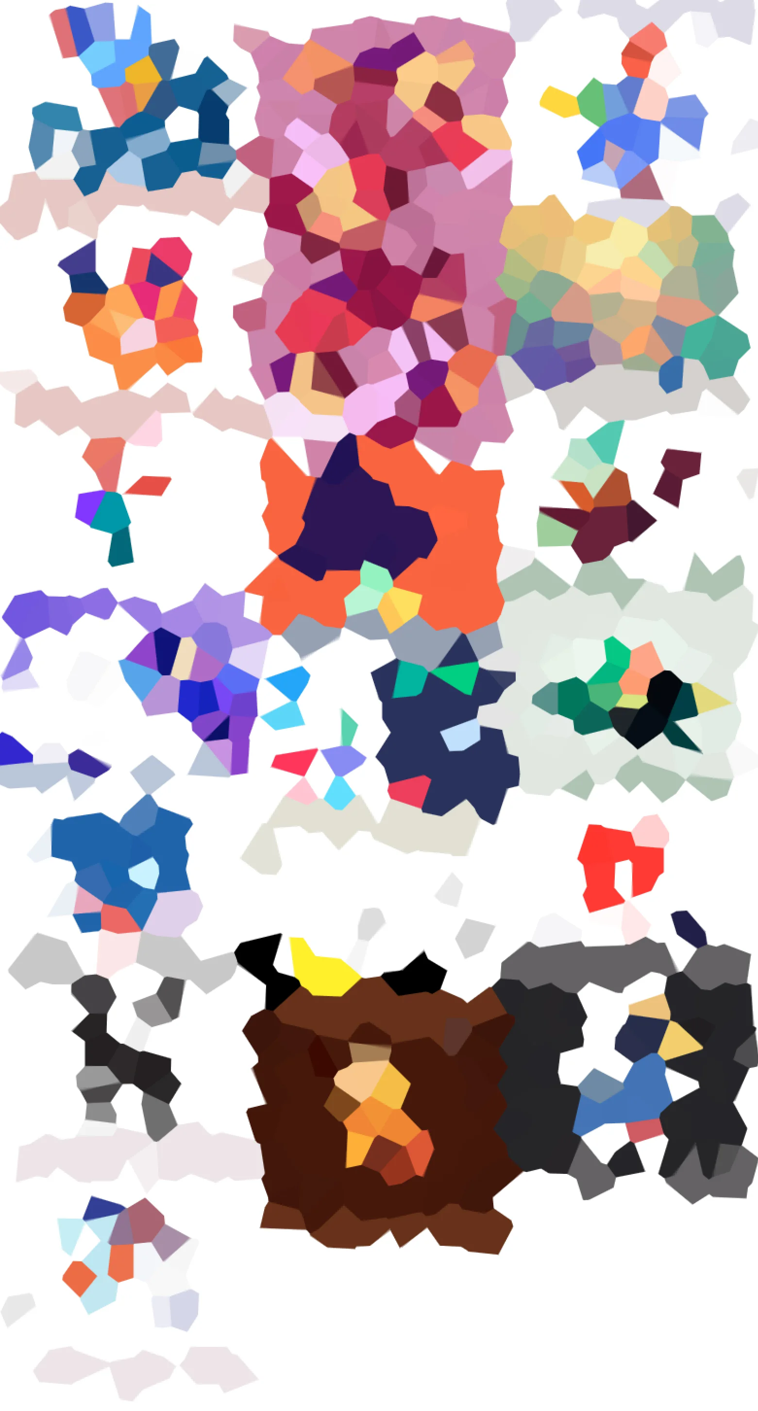
The two most abundant clusters became the primary and secondary colours. The rest (supporting tones, surfaces, alerts) clustered around them in the rough order of dominance. Each colour got named after the keyword or feeling it represented, so when arguments came up later (and they always come up later), we’d be arguing about “the Warmth colour is sitting wrong against the Focus colour,” not “the orange isn’t working with the blue.”
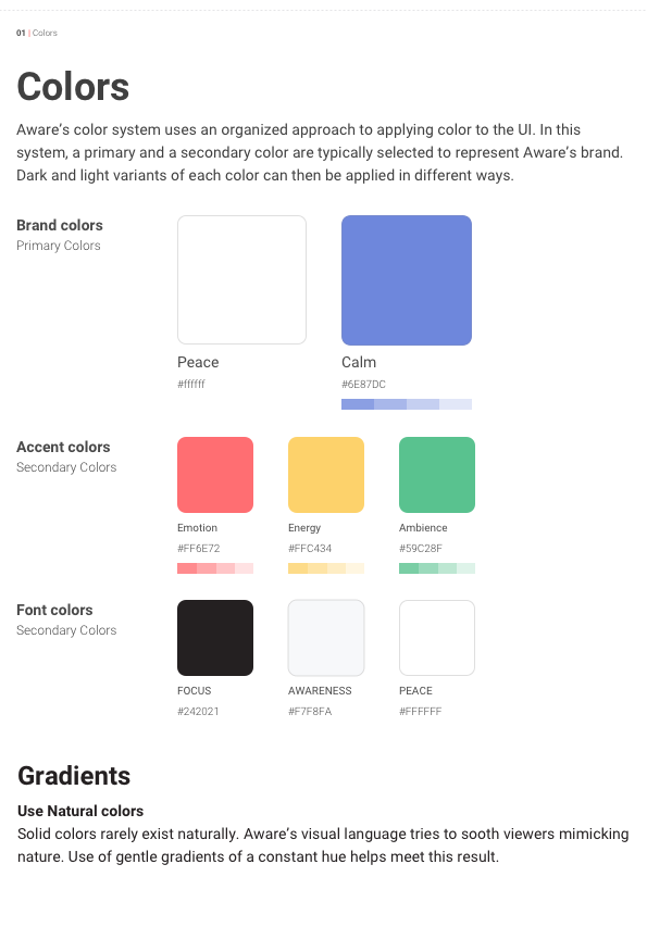
This became page one of the brand documentation, and the reference every later screen got measured against.
Selecting a logo
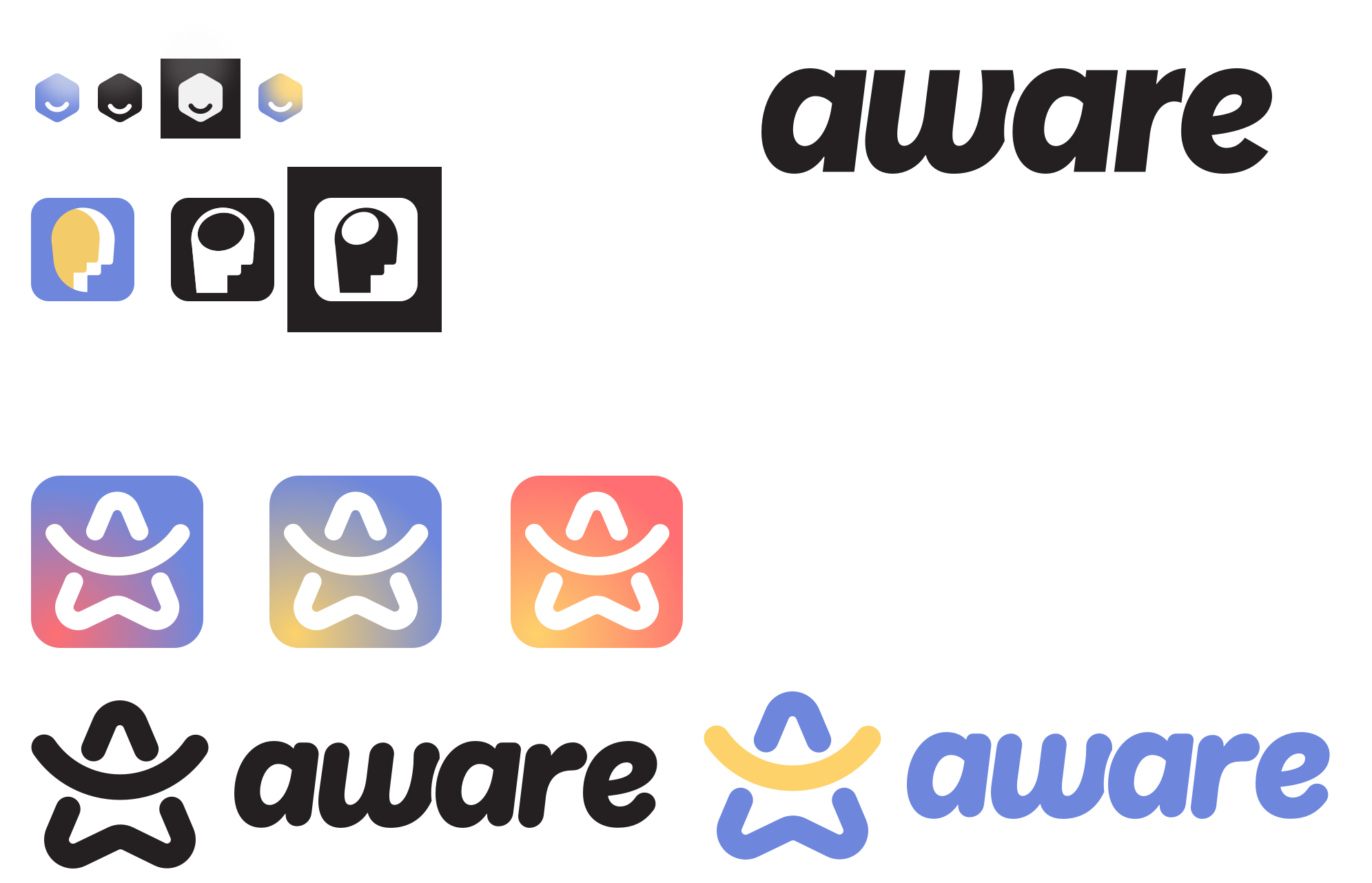
We wanted a logo that was direct, but conceptual. Readable in two seconds, with a second layer underneath for the people who looked closer.
Starting from the definition
To pick a visual concept, we had to be honest about what we were trying to symbolise. We went back to the dictionary:
Mindfulness. A mental state achieved by focusing one’s awareness on the present moment, while calmly acknowledging and accepting one’s feelings, thoughts, and bodily sensations. Used as a therapeutic technique.
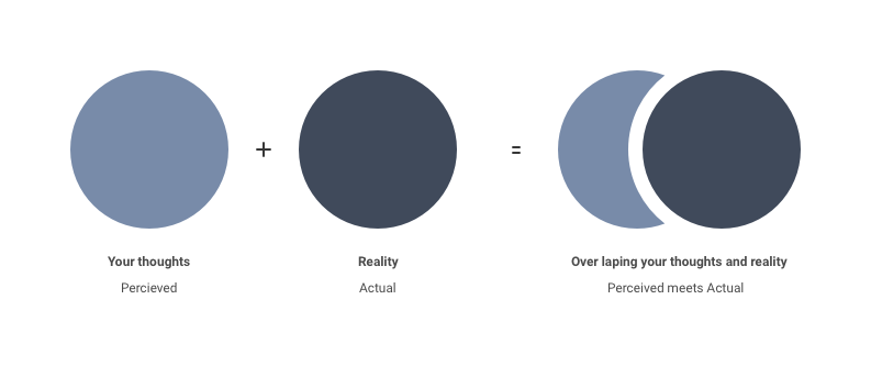
Two ideas in that definition kept turning up in my sketchbook: the halo (the crown chakra, the glow around the head, used historically across cultures to indicate enlightenment) and the circle (eternity, the universe, mystery; geometrically the most “complete” shape there is). Both pointed at the same answer.
Applying the concept to a wordmark
We didn’t want the logo to be a circle. That’s too literal, and it competes with the typography. We wanted the wordmark to feel circular while remaining readable. Three structural decisions did the work:
1. Set the letters along a circular path.
The word Aware is short enough to bend without losing its shape. We curved the letters along a soft arc, just enough that the circular tension was felt rather than seen.
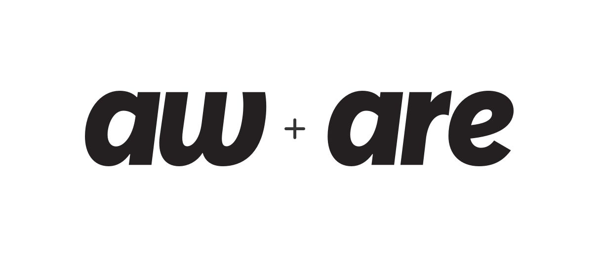
2. Separate the two phonetic halves.
“A-ware” reads in two syllables. Splitting the word visually at that natural break gave us two halves that could balance each other instead of competing.
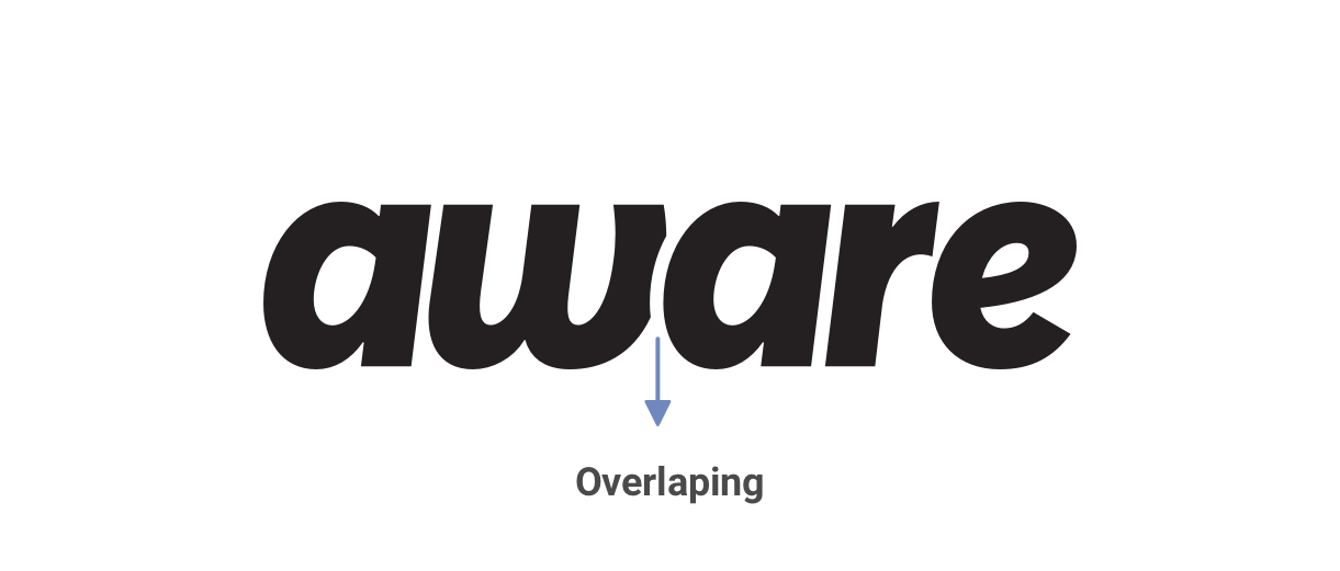
3. Let the halves overlap.
Where the two halves met, we let them overlap slightly, so the word holds itself together visually, the way mindfulness holds an attentive moment together internally. Small structural move; outsized emotional payoff.
What this set up
This was the work that made the 2018 redesign possible. None of the cleanup in that sprint would have meant much if the colour system underneath had still been arguing with itself, or the wordmark had been a circle that read as a circle and nothing else.
Branding rarely makes a product better on its own. But it makes every later design argument shorter, and that compounds across every screen the product ever ships.