Aware UI Colour Exploration and Branding 2018
Aware was launched as a proof of concept, we conducted a weekend hackathon to design and develop the initial prototype of the aware product and we stuck with the product while zoojoobe was in the process of being acquired.
The initial designs looked like this:
Well thats not too good looking
This design looks dated but did give us proof of concept and helped us understand a market fit. We also A-B tested a bunch of combinations and documented the voices that might work and after gathering these insights went on with a baritone male voice.
These designs have no cohesion when it came to colors and a brand story. Also this was a quick High-level prototype, whose purpose was only and only to test the concept.
“Good design is aesthetic”
The Process
We started with a collection of what emotions users of aware and people working on aware would associate with a mindfulness meditation app. we asked them to share "5 - 10 adjectives that you associate with Mindfulness meditation" via a google form and gathered 14 responses.
After collecting the responses we noticed a few words that kept popping up:
Peace, Calm, Happy, Energy, Focus, Minimal, Warmth, Environment.
The Moodboard
Based on these keywords I went on the Dribbble and searched, the results we bore from these results were collected as a mood board for further analysis.
Here is the mood board:
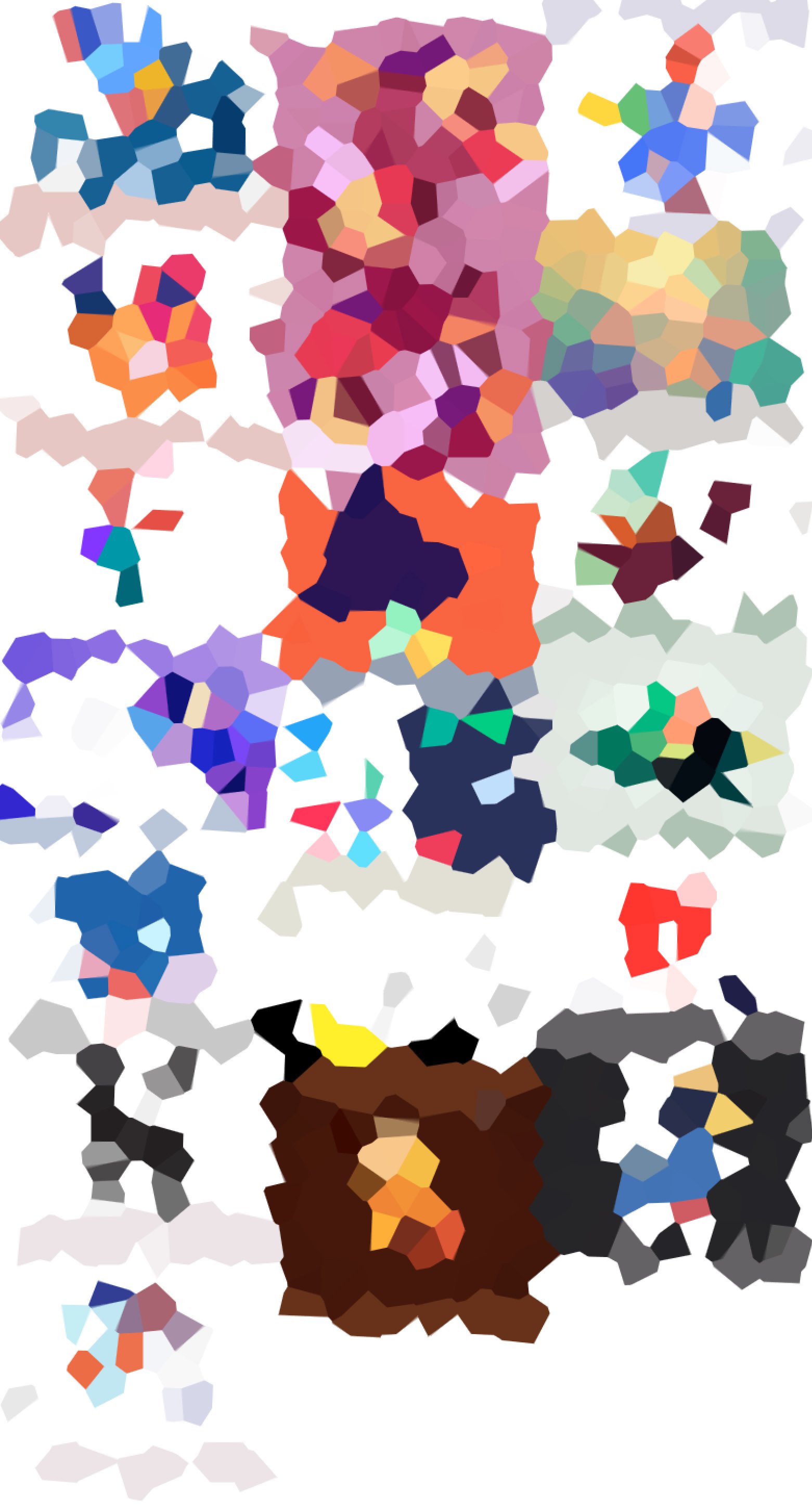
There were obvious colors and shapes that emerged from this exercise. To remove my biases from the process, i turned this into a low poly pixelation of the entire board.
you can now notice the color clusters that form. Making a note of these clusters I gathered them into a sheet. These colors now represent a certain emotion and choosing the primary and secondary color were the two most abundant color from the low-poly diagram.
The color representations were aptly named based on the keywords we choose to represent the emotions/ adjectives aware brand with. and put into the first page of our design documentation.
This would serve as the branding colors for our efforts going forward.
Selecting a Logo
We wanted to make a logo that is direct yet conceptual. Out of the many ideas we explored the one that stood out for being a simple aroach is mentioned below.
What is Mindfulness?
A mental state achieved by focusing one's awareness on the present moment, while calmly acknowledging and accepting one's feelings, thoughts, and bodily sensations, used as a therapeutic technique.
Applying this concept to a word mark
Traditionally the Glow around your head also called a Halo or 'the crown chakra' is used to demarcate enlightenment. Circles also mean Common meanings: eternity, female, universe, magic, mystery. We wanted a logo that was circular and clean, also clearly readable.
Simple word written in circular font.
Separating the two phrases, and visually balancing the two halves
Implementing the overlap


